When designing a website for your B2B business, the rule of thumb is to put the buyer’s needs first. It is neither too expensive nor is it complicated. So, if you are looking to change your “online brochure” of a website into something that brings you more business, then here’s the B2B Website design guide for you.
Any effective website design should attract, engage, and interact with its audience. Following this simple gospel can help you reach more conversions and find the right vibe for your business’ online presence.
Understanding the basics
Gone are the days when websites were just built on design and look. Now, it may have had its strong points, but today, the internet and buyers have evolved.
As search engines have evolved, the power of reach and penetration has shifted from businesses to buyers. Today, your B2B business must focus on “being found by the right people” rather than look out for them.
Today’s website has become the cornerstone of a buyer mentality based on self-serving research before making purchases. If we combine these two principles, your B2B website design should focus on helping people make informed decisions while also converting qualified leads into business.
Tough ask?
Let’s find out.
What is an effective website design?

While looks do matter, an effective B2B website design is a lot more than that. There are several components to consider.
- What is the website strategy?
- How will it be structured?
- What is the SEO plan?
- How will content be laid out?
Answering these questions and building a b2b website design that attracts, engages, and converts visitors is the core of business website design. From here on in, our guide is based on practical use cases, best practices, and research to help your business get nothing less than the proper exposure.
Table of content
- What makes an effective website?
- How to conduct the research?
- How to strategize?
- How to plan?
- How to design?
- How to optimize?
What makes an effective website?
The definition of an effective B2B website design is simple: It should generate leads for your business.
To do this sufficiently and help your business grow, your website must fulfil a few different objectives.
- Get traffic

To get traffic, your website should be discoverable and present in relevant channels.
- Engage visitors
This aspect covers several things, from establishing a connection with the audience to elaborating the customer journey and finally sharing positive user experiences.
- Convert Visitors
It should be compelling enough for the visitor to make a purchase decision or find out more about the product.
While all of this sounds complicated, it is not. Changing to a more buyer-centric approach is all you need to make the difference.
How to conduct the research?
While adapting to the new website, the first place of learning is and should be your current website. The first step is to ensure that you have Google Analytics and Search Console running on your website for as long as possible.
For more information – Read our website checklist
Look for pages with the most and lowest traffic
Pages that get a large share of the traffic are what you should consider “model pages.” These should retain their place within the sitemap. It is the ones that have the lowest traffic. Before scrapping them, consider if they have had a lousy SEO situation or are not well-focused on the sitemap. Often, good web pages too attract less traffic because of it.
Find out the technical problems from the search console

Dive into the search console data to determine if there are any technical problems. Inaccurate sitemaps, crawling errors, or manual spam actions can be terrible for your web pages. Take down notes and find out the best practices to resolve the problems.
Install Hotjar

Hotjar is a marketing tool that allows you to find out exactly what parts of your website get the most traction and what factors underperform.
Check out the competition

Don’t go for blind copying of your top competitor’s website.
All brands have unique positioning. Suddenly changing yours into something else that customers do not identify with could do more harm. While checking out competitors, make sure you look for their strategy.
Use marketing tools like SEOBook’s Keyword Density Analyzer to find out the most frequently used phrases on their website. This information can help you with your keyword planning, level, and overall playing field as far as organic reach is concerned.
Evolving with time
Trends in the online world are continually changing. Fortunately, enough people are taking down notes to help you understand what works and why. Just google around a bit to find out the latest trends in your industry.
An excellent way to get the most out of your time is to look into more SaaS websites. These run on leaner content and are optimized for every penny spent on them. Studying a bit of them could help you learn how to nail the minimalist approach.
How to strategize?
Proposing Value

Any good B2B website design must have a concise and clear value proposition. The idea is to connect to the audience from the moment they land on your website and build trust slowly as they explore the various aspects.
The best way to ensure a clear connection is to state clearly your objective and the value you are looking to add to their businesses. Avoid any ambiguity about your product or service.
Announcing your value by elaborating on what you do and who your target audience is, makes it easier to create an instant connection and get them interested. Your value proposition should guide your entire keyword and copy planning and influence your website’s design. It becomes the lens through which you can measure your successes.
Keyword Strategy

Any B2B website’s primary goal is to be found on the SERPs by prospective buyers at any stage of the buying process. This can only be achieved when you plan your keyword strategy before designing.
Identifying target keywords and implementing them throughout the website, from URL names to content and page names, can help you rank high on results. As a company, you should also ensure that your social media, blogging, and content marketing are built around the same lines as your b2b website design.
This reverse approach is often more effective than researching and implementing your keywords once you have already designed the website.
Use tools like Moz, SEMRush, and SE Ranking to find out the most competitive keywords with high search volume and where you rank with them. Use these three metrics to shortlist your keywords and build a good keyword strategy that is achievable and effective.
You also need to find out which keywords your website is ranking on currently and if those keywords are desirable and attractive from the customer’s point of view. In the meantime, continue looking for unique keywords that match your buyer’s persona and product to increase your reach beyond top competitors.
Once you are ready, this strategy will be the skeleton to build a successful and high-performing B2B website.
How to plan?
Sitemap
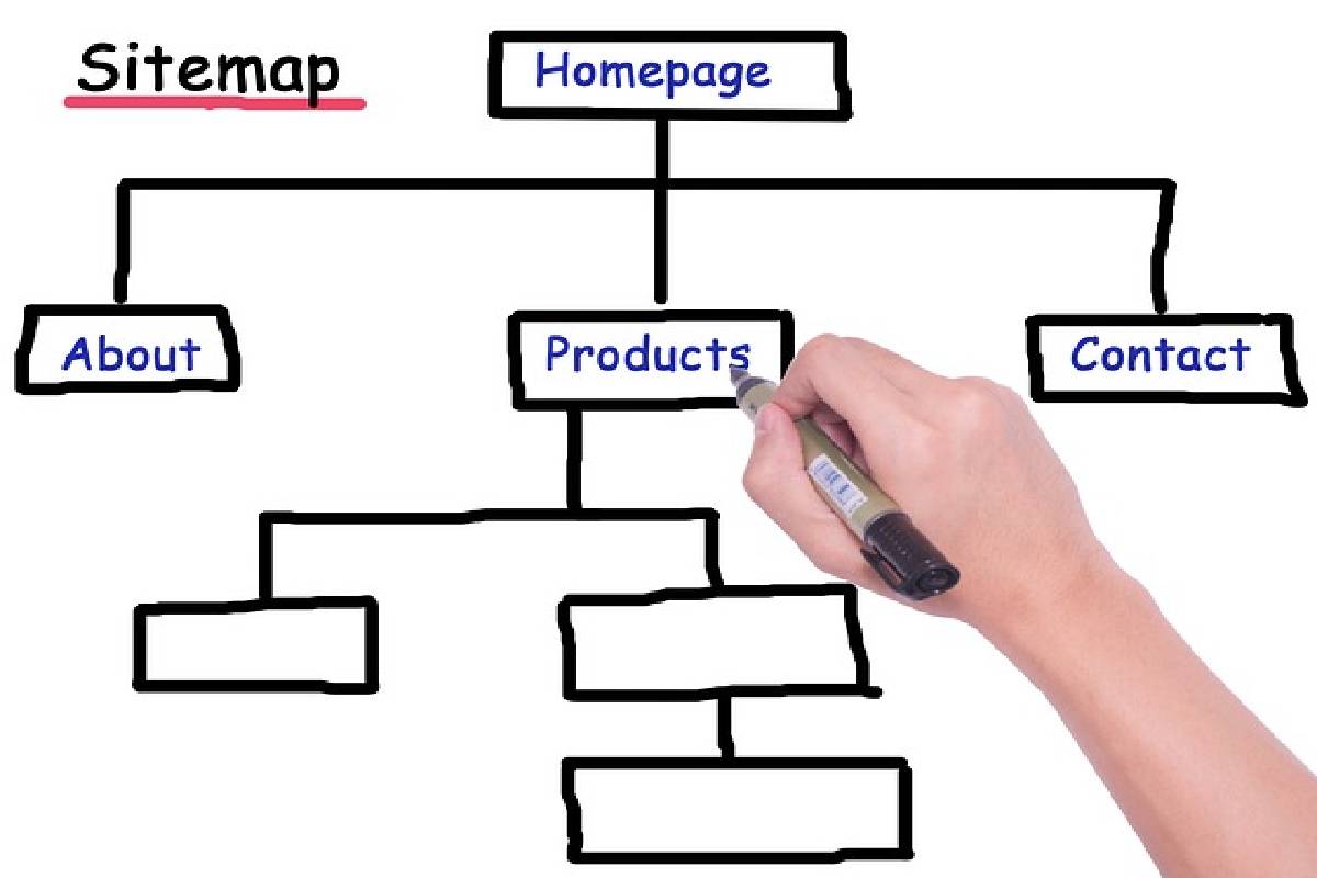
The sitemap plays an integral role in website design. It shows which pages will be built and where they will be located. Everything you have researched till now should factor in during this phase and will help you focus on pages that are pivotal to your keyword strategy.
Sitemaps differ from one another, but the rule is to stick to less. No business executive is on your site for a reading spree. They are there to find out what you can do for them, so cut to the chase.
Also, make sure that you have all the pages representing your buyer’s journey. If you are offering professional services, then focus on hitting hard with your homepage, services, different case studies, and finally, the consultation offer. On the other hand, SaaS companies should focus on features, home, pricing, and a trial or demo offer.
Nevertheless, do not forget to include:
- Terms and Conditions and Privacy Policy
- Blogs
- Landing Pages
- Acknowledgment Pages
You can chart out your b2b website design sitemap bon several chart-making tools available online.
Navigation
The function of a website’s navigation is often overlooked.
Many B2B websites use an enormous navigation system with dropdowns, categories, and a long list of pages for the visitor to pick. Now that it is spelled out, it does sound like a bad idea. Every business has to understand that it is their job to get the audience on the right content page and not the audience’s job to head on a treasure hunt. Business executives are always running on time.
To fix this, have a defined customer journey on the website and tell them how they benefit from your offer.
You don’t necessarily need to get rid of all dropdowns – keep things subtle. Focus on placing precision CTAs to guide your visitor through the site. This leaves an impression that you know why they are here. Another growing trend is to place the page links on the footer, where visitors will end up after finishing each page.
In conclusion, your navigation should cut the clutter and have pages contributing to the conversion. Also, ensure that you are clear about the difference between navigation and sitemap. Navigation is the index of a website with all the necessary pages you want visitors to go to; site maps are the flow you expect them to go through the journey.
Agile Delivery
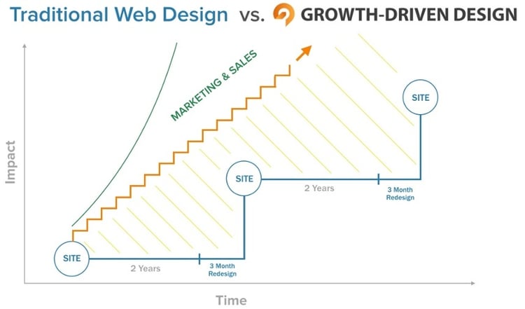
HubSpot’s Luke Summerfield pioneered a design called the growth-driven design, a perfect model. With the GDD approach, you work on your website in short dynamic sprints that depend on various metrics instead of planning everything ahead of time.
There is no need for developers to wait for months unless every page is ready to go live. The idea is to prioritize chunks and deliver on them in short periods, thus increasing speed and efficacy.
Waiting to launch all at once also leaves you susceptible to losing buyers, audience, and credibility, because you don’t know how your new pages are performing. Getting to the minimal viable product as fast as possible can make a significant difference. Only 20% of the website’s pages will do 80% of the work, and launching them in short and fast spurts will give you the feedback you need to develop later.
You can color-code your sitemap to show differing levels of priority and which pages are going out during which phase of development. Once your initial steps are launched, you can use the user feedback to make changes and optimize results.
How to design?
Copy and wireframes

Before you start to design, make sure you are ready with the content and framework of your first phase pages.
With wireframes and real copy, planning the customer journey will be much easier for you, and you can work on the pieces and the whole website at the same time. The distinct advantage of wireframes is that since they are cheaper and easier to handle, they are readily iterated. This is the only way to design the most effective website without getting involved in heavy slug work.
There are different levels of wireframes, and you should ensure new inputs only when you are confident about the content.
You can design wireframes on many software, including Illustrator and Photoshop.
Home Page Design
The homepage is the centerpiece of every website, and reaching a consensus can become difficult. Some of the challenges in creating homepage design are:
- It is the first page for most visitors
- There is no guarantee which part of buying phase visitors will be in
- Visitors can choose to stay or bounce at any time
However, if you are looking for a guide to remarkable homepages, then go no further than Slack. Easy, simple, and straightforward, their homepage introduces the product, delivers the proof, and gets straight to the CTA, all in one go!
Also, it is more or less known that sliders or carousels are not as effective as they look. They lack SEO potential and deliver a shabby user experience. You need more than one H1 heading with sliders, diluting your homepage SEO and confusing visitors as to what it is you offer.
If possible, forget sliders and come with an unmistakable top banner for the homepage that delivers the hit. There’s a page for everything else already.
Other things that work on the homepage:
- Tell your visitors why you are the best choice
- Show your customer logos and testimonials
- Provide the next step for them with precise CTAs
How to optimize?
Conversion optimization
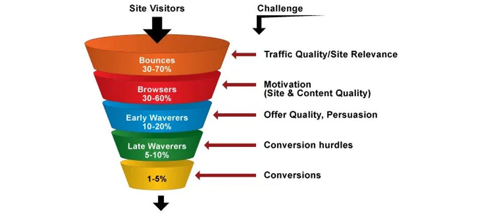
An effective website converts visitors into leads, prospects, or customers. Many websites rely on the contact page for all of these functions. However, very few pages have effective contact pages that help conversions.
To maximize conversions, it is better that you spread out multiple points of conversion throughout the website. Also, instead of using something as bland as ‘contact me,’ go for multiple specific CTAs like ‘request pricing,’ ‘book a demo,’ and other similar phrases.
Conversion points can redirect to the landing page or contact forms placed right on the page in question. You can also use footer contact forms throughout the website, thus decreasing their effort to give any feedback or register an inquiry.
You can use various forms and databases to enhance direct communication with visitors.
Search Engine Optimization
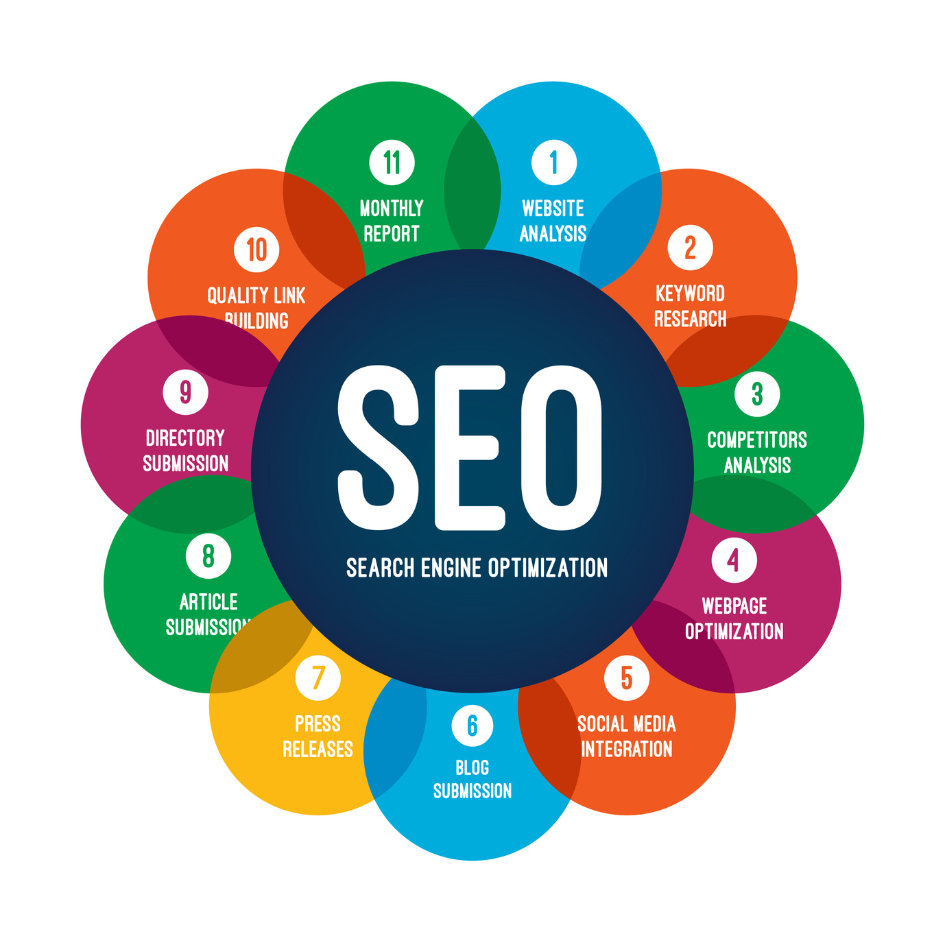
After your design and website development are complete, it is time to focus on the SEO aspect. The key is to aim for organic traffic through:
- Using keywords in page meta titles
- Writing concise and synchronized page meta descriptions to improve click-through
- Featuring target keywords in the H1 tag
- Implementing target keywords in body copy
- Using naturally appearing keywords to hyperlink to other pages
- Using target keywords in image alt tags
While SEO in itself is a vast subject that needs its guide, one can follow a few thumb rules on their website.
- Stick to your keyword strategy
- Follow a keyword pyramid. The homepage is always on top, followed by others. Use your highly targeted keywords on this page.
- Websites do not rank. Focus on individual pages and which keywords work best for them.
We hope our guide can help you build exciting websites that are clean and communicate effectively. That’s the way to converting visitors into business partners, buyers, customers, or prospects.


